Custom Reports
The Custom Reports feature in CloudSpend enables you to unify all your organization's cloud cost data in a single, customizable view. You can create tailored reports by adding various widgets, each offering valuable insights into cloud spending trends and usage patterns across multiple cloud environments like AWS, Azure, and GCP.
This centralized reporting feature enables your organization to efficiently monitor its cloud expenses, make data-driven decisions, and share insights with team members via emails or exported PDFs.

Benefits of Custom Reports
Custom Reports provides you with the following benefits:
- Unified cloud cost view: Access all your cloud spending details across AWS, Azure, and GCP in a single, easy-to-manage report.
- Customizable widgets: Personalize the layout by adding, resizing, and arranging widgets, such as Summary, Spend Analysis, Inventory Usage, and Anomaly, for your preferred date range.
- Real-time insights: Monitor cloud costs in real time and identify areas for optimization without switching between multiple reports.
- Collaborative sharing: Effortlessly share your customized reports with colleagues or external stakeholders via email or export them as PDFs.
- Correlate between cost accounts: View cloud costs for different accounts in a single report to identify cost differences easily.
- Group related entities: Group entities, such as services, regions, or accounts, for different accounts to get a clear understanding of spending patterns across those groups.
- Improved efficiency: Gain detailed and focused insights by setting up widgets that target key areas of analysis for your cloud spend.
How to add widgets
To add widgets to Custom Reports, follow the below steps:
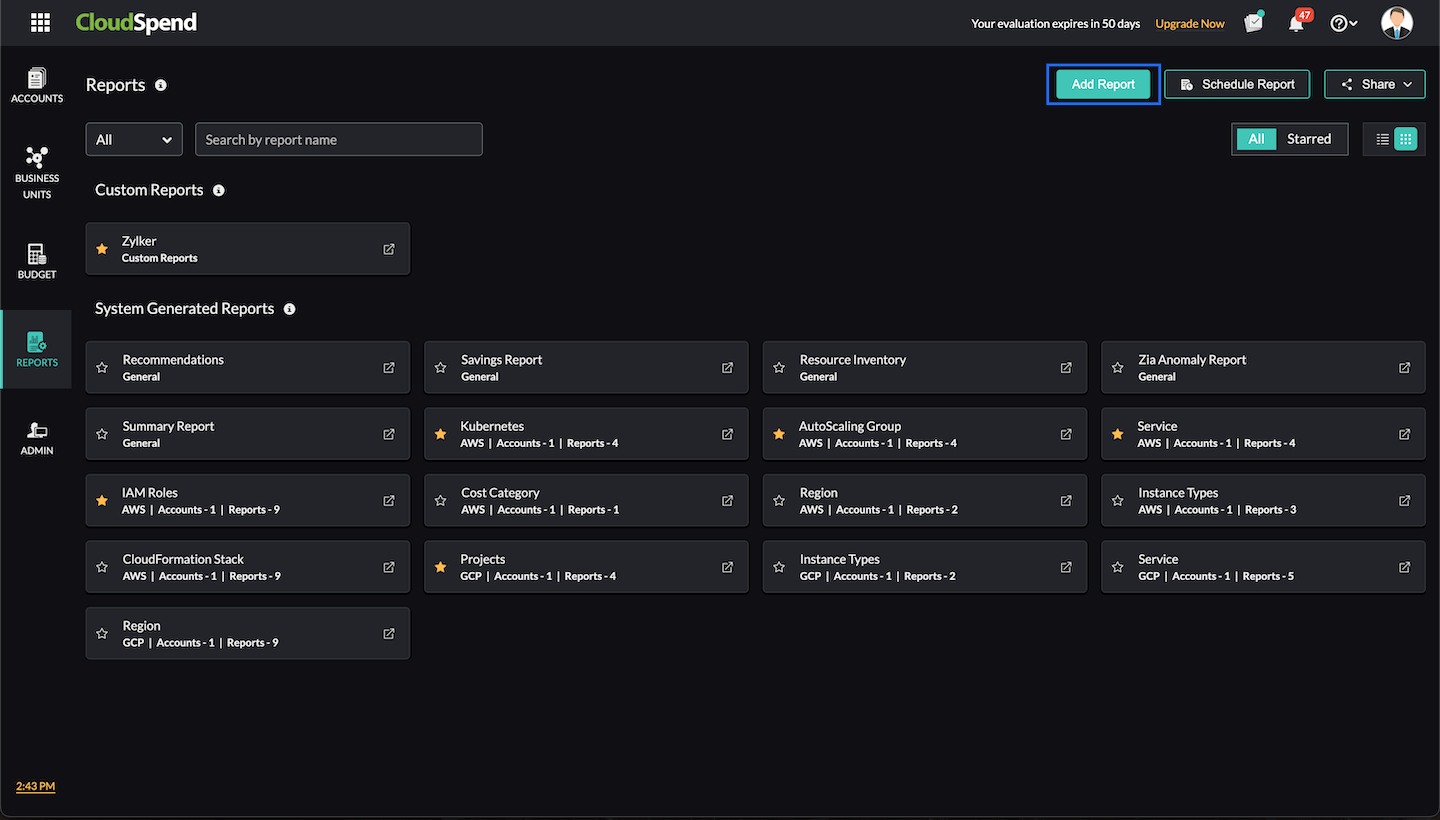
- Navigate to CloudSpend > Reports.
- Click Add Report to create a new report.

- Provide a report name and description.
- Click Add Widget to begin customizing your report with different widgets.
- Arrange and adjust the column view and auto-arrange widgets as needed to create an optimized layout. The column limit is set to three by default. However, you can modify it based on your preference, with three being the maximum.
- Once your widgets are added, click Save.
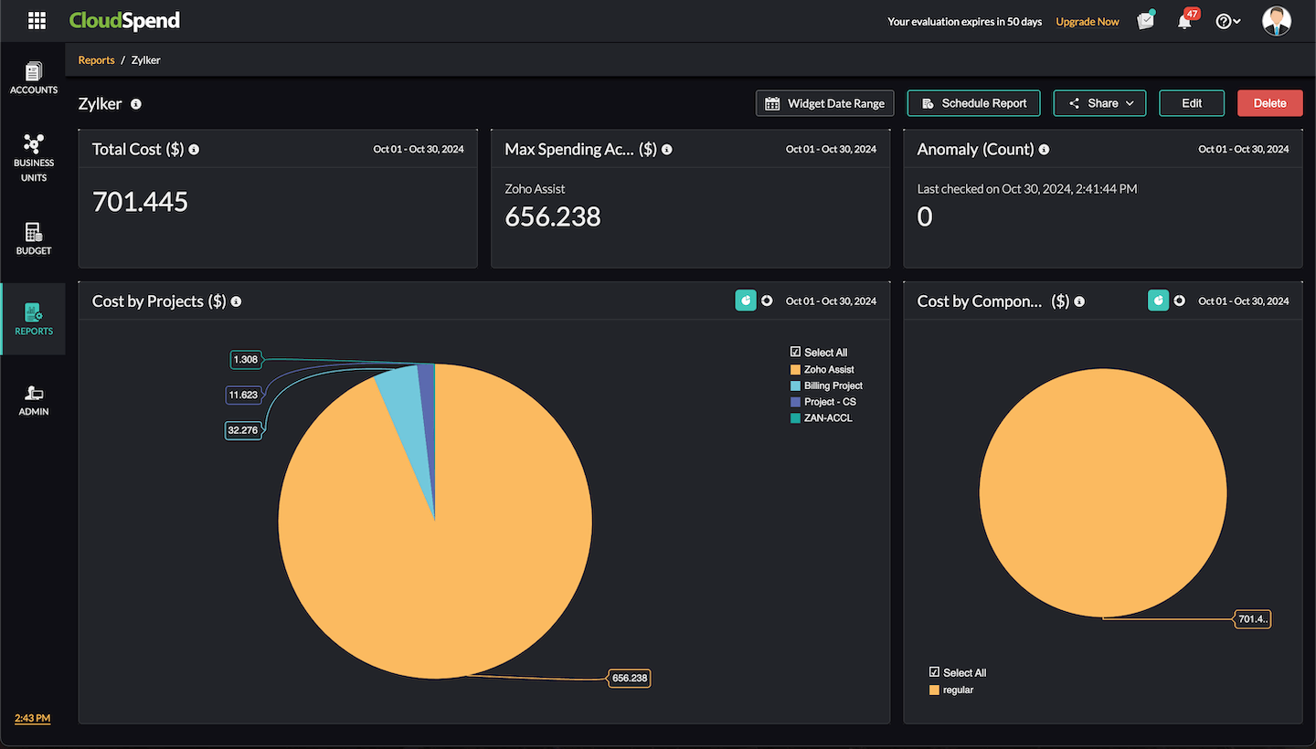
Your custom report will be displayed in the Reports > Custom Reports section, where you can edit or delete the report as needed. Additionally, you can edit or delete individual widgets. You can also drag and rearrange widgets according to your preference.
Widget types
CloudSpend supports the following widget types for Custom Reports:
- Numerical: Displays the cloud cost data for your cost accounts in a numerical format.
- Sankey chart: Illustrates the flow of cloud cost data for your multi-cloud environment.
- Pie chart: Displays the proportional breakdown of cloud cost data as color-coded segments.
- Bar chart: Displays the cloud cost categories as a graph with vertical bars for easier comparison.
- Table: Displays the cloud cost data in tabular format.
- Trend: Displays the cloud cost changes over time as a line graph.
Available widgets
The Custom Reports feature offers the following widgets to provide detailed insights into your cloud spending and resource usage. These widgets can be tailored to your specific needs, helping you monitor costs, track resource utilization, and identify potential savings across your multi-cloud environment.
Summary
The Summary widget provides your overall cloud cost details at a glance. It gives you the flexibility to switch between multiple viewing formats to understand your cloud expenditure better.
- Numerical widget: Provides the Overall Cost($), Month-on-Month Cost($), or Year-on-Year Cost($) for your cloud accounts. You can select a date range to filter the data and obtain the relevant cost metrics for a given time period.
- Sankey chart widget: Displays a visual representation of your multi-cloud infrastructure's cloud cost flow. This format is ideal for tracking how costs are distributed across accounts and services over a selected date range.
- Table widget: Displays cloud costs in a tabular format, showing total cost, Top N reports, and cloud discounts for your multi-cloud environment.
- Pie chart widget: Visualize your cloud cost data as a pie chart. You can display the Overall Cloud Cost($), Top N Reports($), and Cloud Discounts($) for a selected period.
Spend Analysis
The Spend Analysis widget provides a comprehensive breakdown of cloud spending across your AWS, Azure, and GCP environments. It offers multiple visual formats to help you understand and analyze your cloud expenses across various accounts, regions, and services. The widget supports filtering by tags, allowing you to narrow down your view to specific accounts, services, or regions while providing detailed insights into different cost types.
- Numerical widget: View the Total Cost, Max Spending Account, and Min Spending Account details for your AWS, Azure, or GCP accounts over a selected time period. You can filter the cost data by tags to refine your view. For AWS, the cost type can be filtered as Blended, Unblended, Amortized, or Recurring. For Azure, the cost type is filtered as Actual Cost, and for GCP, it can be filtered as Actual Cost or Credits.
- Pie chart widget: This widget provides a breakdown of cloud costs based on your selected parameters. Choose the applicable cloud service provider (AWS, Azure, or GCP) and use tags to narrow down the data. The table below shows the available criteria with which you can view and filter the data for each cloud service.
Cloud service View cloud cost by Supported cost types AWS Account
Region
Service
Data Transfer
Component
Instance Type
ResourceBlended
Unblended
Amortized
RecurringAzure Subscription
Location
Service
Data Transfer
Component ResourceActual Cost GCP Project
Region
Service
Component
SKUs
ResourceActual Cost
Credits
- Bar chart widget: Similar to the pie chart, this format displays the same data but as a bar chart for a clearer comparison between cost categories
- Table widget: Get the same data as in the pie and bar charts but in a tabular format. The table format allows for easier manipulation of large datasets, with the same filters available for AWS, Azure, and GCP.
- Trend widget: Track spending patterns over time using a trend chart, which allows you to monitor the direction of your cloud costs on a daily, monthly, quarterly, or yearly basis. You can also filter the data by tags and cost type for AWS, Azure, and GCP accounts.
Inventory Usage
The InventoryUsage widget provides insights into how your cloud resources are being utilized across accounts, services, and regions. This widget gives a clear picture of how cloud resources are being consumed within your AWS, Azure, and GCP environments, helping you track and optimize resource usage across your cloud infrastructure.
- Trend widget: View cost trends for your cloud accounts in multiple time frames, including daily, monthly, quarterly, and yearly trends. Narrow down your search by applying tags, allowing you to focus on specific resources, services, or accounts for a selected date range.
- Table widget: Obtain a tabular view of cloud cost data for your AWS, Azure, and GCP resources, based on Accounts, Services, and Regions. This widget allows you to track the resource count and resource usage for each account, service, and region within a specified date range.
Anomaly
The Anomaly widget identifies unusual spending patterns in your cloud infrastructure. It is designed to help users detect cost anomalies early, allowing for proactive management of cloud costs and avoiding unnecessary overspending.
- Numerical widget: This widget shows the cost anomalies in your AWS, Azure, or GCP environments. You can apply filters to narrow down anomalies by tags or cost types. Supported cost types include Blended, Unblended, Amortized, and Recurring for AWS, Actual Cost for Azure, and Actual Cost and Credits for GCP.